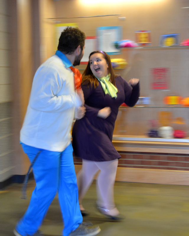
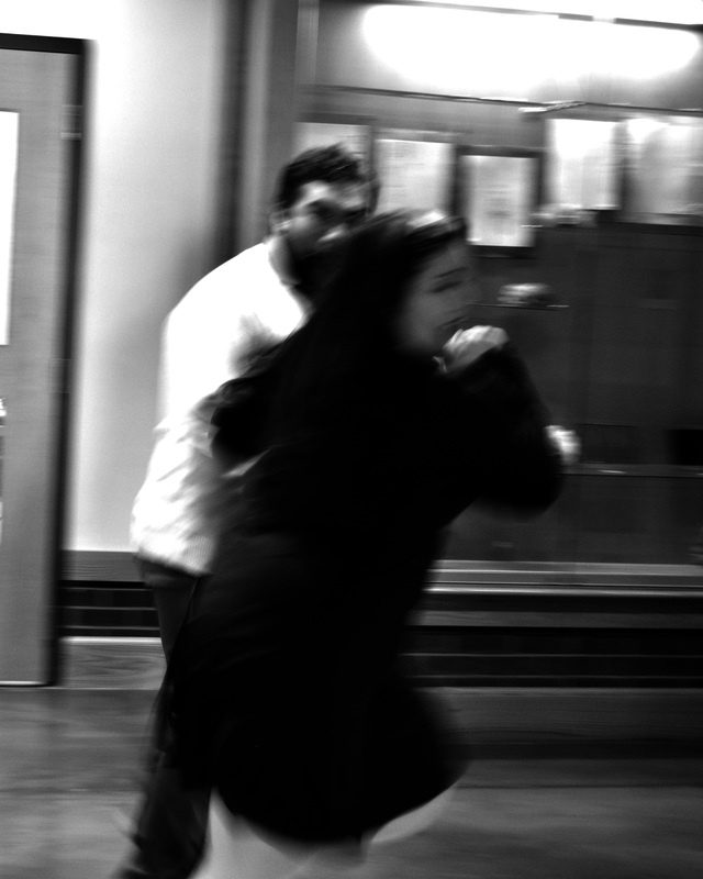
Term 2 (Motion)
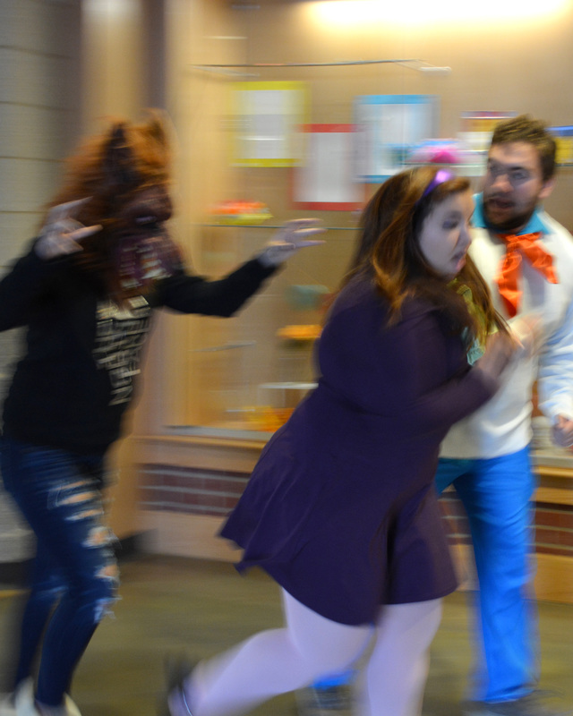
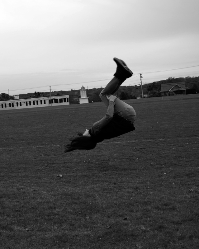
For the seventh image I used a fast shutter speed of 1/400th of a second. The ISO I used was 400 and the white balance on my camera was cloudy due to the conditions outside when we took the photos. The action I was was a flipping motion. The girl in the photo was in the middle of a backflip when I took the photo. I was very close to the girl when she was doing the backflip and my point of view was directly in line with her because my camera was on the tripod. I feel that the positive and negative space as well as the range of values make this photo very strong.
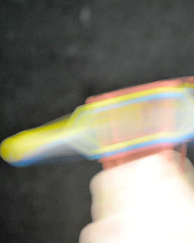
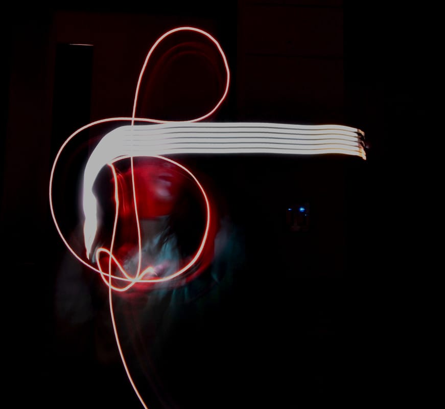
The 1st image is an extremely slow shutter speed of 1 second of light exposure. The ISO I was using was 500 and the white balance was on fluorescent light. I froze the action of someone spinning clackers around and slowed the shutter speed to allow for a lot of blur within the image. I was extremely close to the clackers as I wanted to be able to capture just the object as much as I possibly could. One thing that I believe that makes this photo very strong because it has a lot of strong colors due to the massive amounts of blur within the photo.
Painting With Light
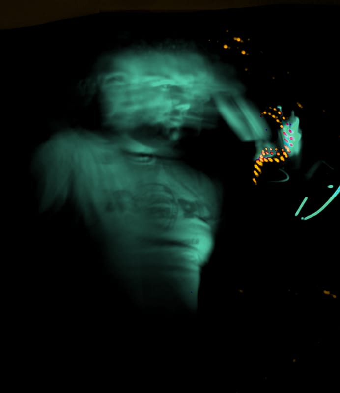
The photo that was my favorite of painting with light was the first image. I was clicking a blue light on and off to my face and someone was bouncing a ball in the background as well. The shutter speed my camera was on was 10 seconds which allowed for a massive amount of light to be exposed. The source that I was using was a blue light thats handle was simliar to that of a lioght saber and I shined it contiunesly on and off my face, as well as moving around slowly as well. I created the effect in photoshop by adjusting the colords and actually changed my figure to green because I felt that it gave the image a more eerie feel, similar to a ghost. I also played with the saturation as well as the hue in order to change a lot of the colors in the image. I feel the viewer should feel looking at this photo in a way of first looking at my face and then following the lights.
Aperture
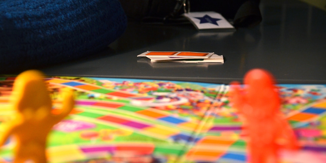
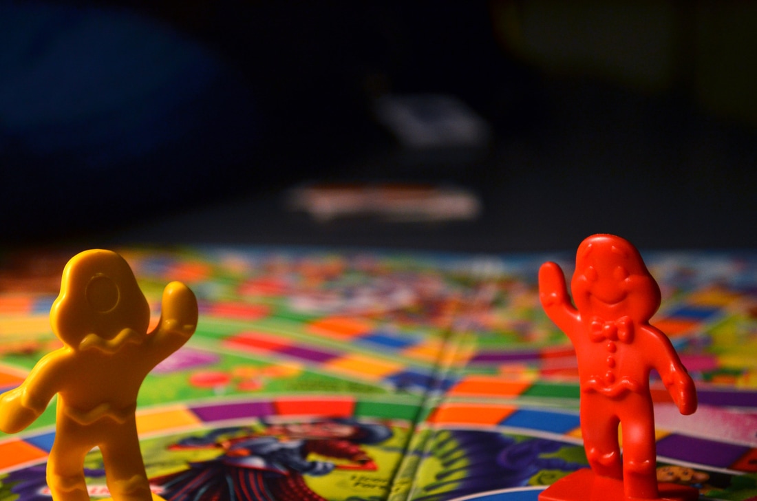
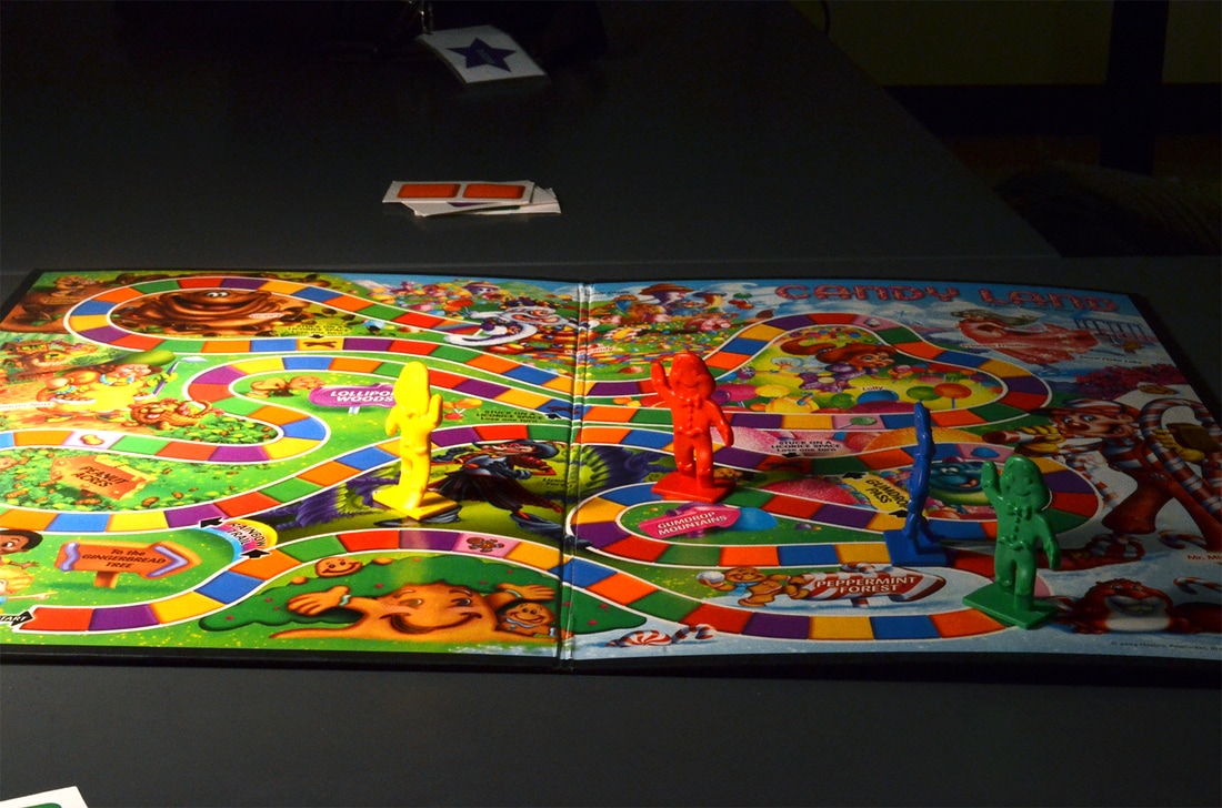
In the middle photo of the candy land set where the foreground was in focus I was using a f/5.3. I was on a 800 ISO and my white balance was set on fluorescent.
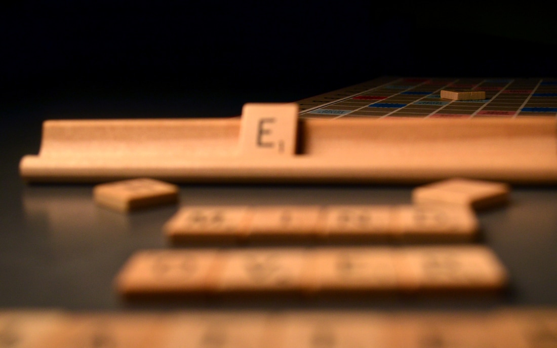
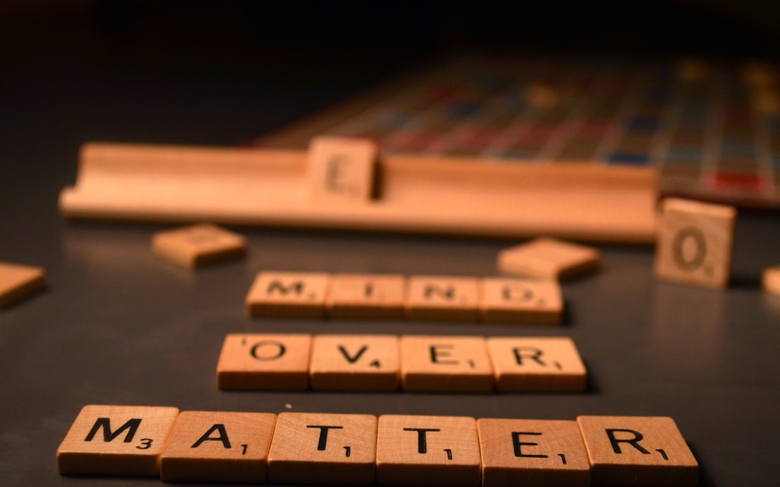
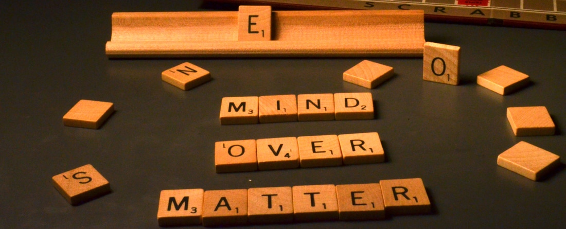
For the third photo in the mind over matter set where the entire image is in focus I was using a f/32 setting to create the large depth of field. Also, my ISO was set on 1600 and the White balance was set on fluorescent.
I feel that the better photo is the one of the candy land set because I feel overall the piece that is in focus is a lot clearer than the one where the entire photo is in focus. Also, I feel that the candy land photo looks crisper and is more drawing to the eye than the scrabble pieces. The reason that a shallow depth of field would be used is to focus on one thing in particular that you really want to stand out over the entire photo. A large depth of field would be better when trying to take a photo of a landscape, such as the grand canyon, in order to capture multiple things and keep them in focus in order to truly see the entire image clearly.
Color Correction
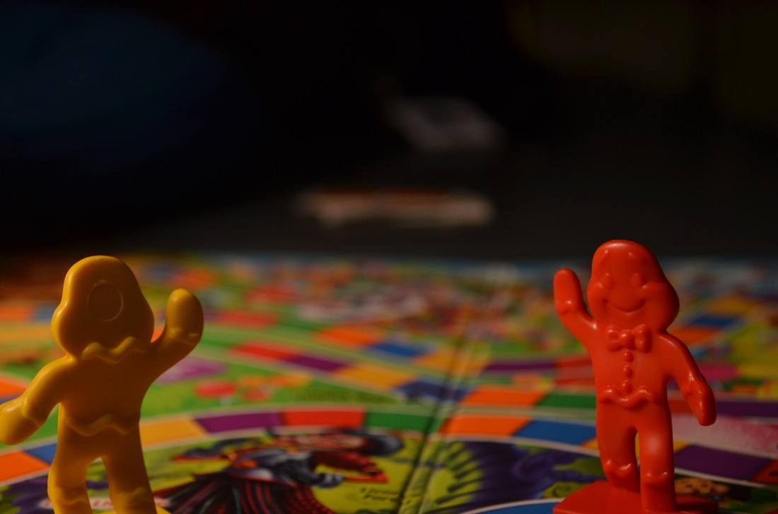

One thing that I notice right away about my color correction is how much sharper the reds and blues look in the photo on the right. I see in the image on the left is that the red character from Candy Land almost looks like he has an orange tint to him. However, once I color corrected the image is clearly red and has a sharpness to it, even better than in the image on the left.
Aperture Homework
EXTRA PHOTOS